Start with the ecosystem
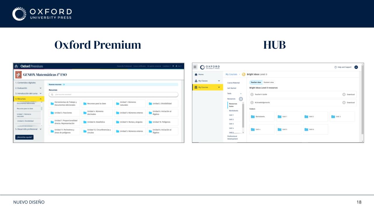
I mapped the platform, its flows and its relationship with HUB before defining shared patterns.

I led the foundations of a design system for Oxford Premium as part of a wider platform redesign and rebranding initiative.
At a glance
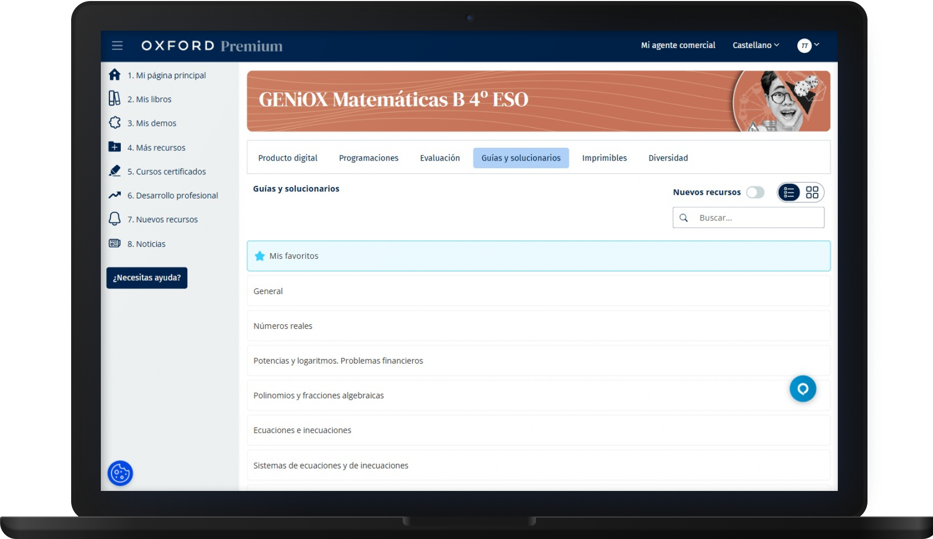
Oxford Premium had grown without a shared design language. Different areas of the product had started to drift apart, while the platform also needed to move closer to Oxford's UK platform, HUB.
As the sole UX/UI Designer, I connected platform research, interaction design, visual direction, component foundations and implementation support.
The decisions
I mapped the platform, its flows and its relationship with HUB before defining shared patterns.
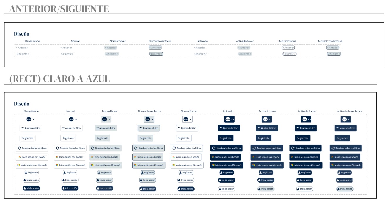
I defined foundations for typography, colour, spacing, components, states and responsive behaviour.
I documented behaviour and worked with development so the system could be introduced progressively.
Evidence
The work was not just a component library. It connected visual alignment, interaction patterns and implementation decisions across the platform.
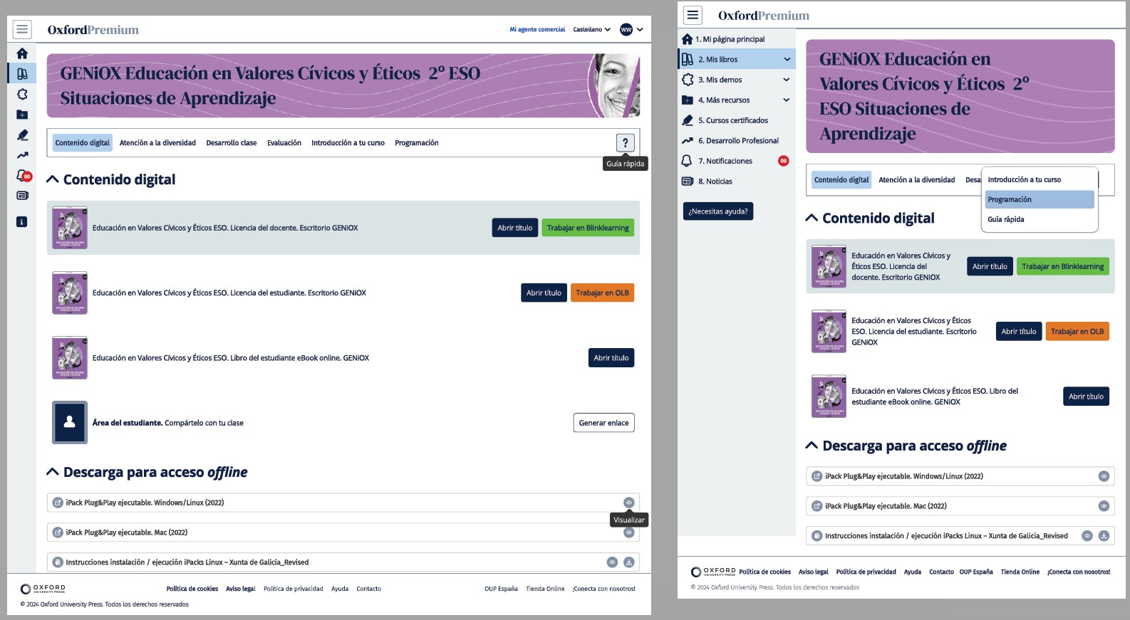
The login flow uses the same visual foundations and interaction conventions as the rest of the platform.
The component library helped replace patterns that had drifted apart across different areas of the product.
The Commercial team requested a pop-up with a very specific design and format. Working within that constraint, I adapted the UI as far as possible to the existing system so it remained coherent with the rest of Oxford Premium.
Outcome
The clips show Oxford Premium's demo account. No real school or customer data is included. Internal process material is kept in the Deep Dive case study in adapted form.