Desktop
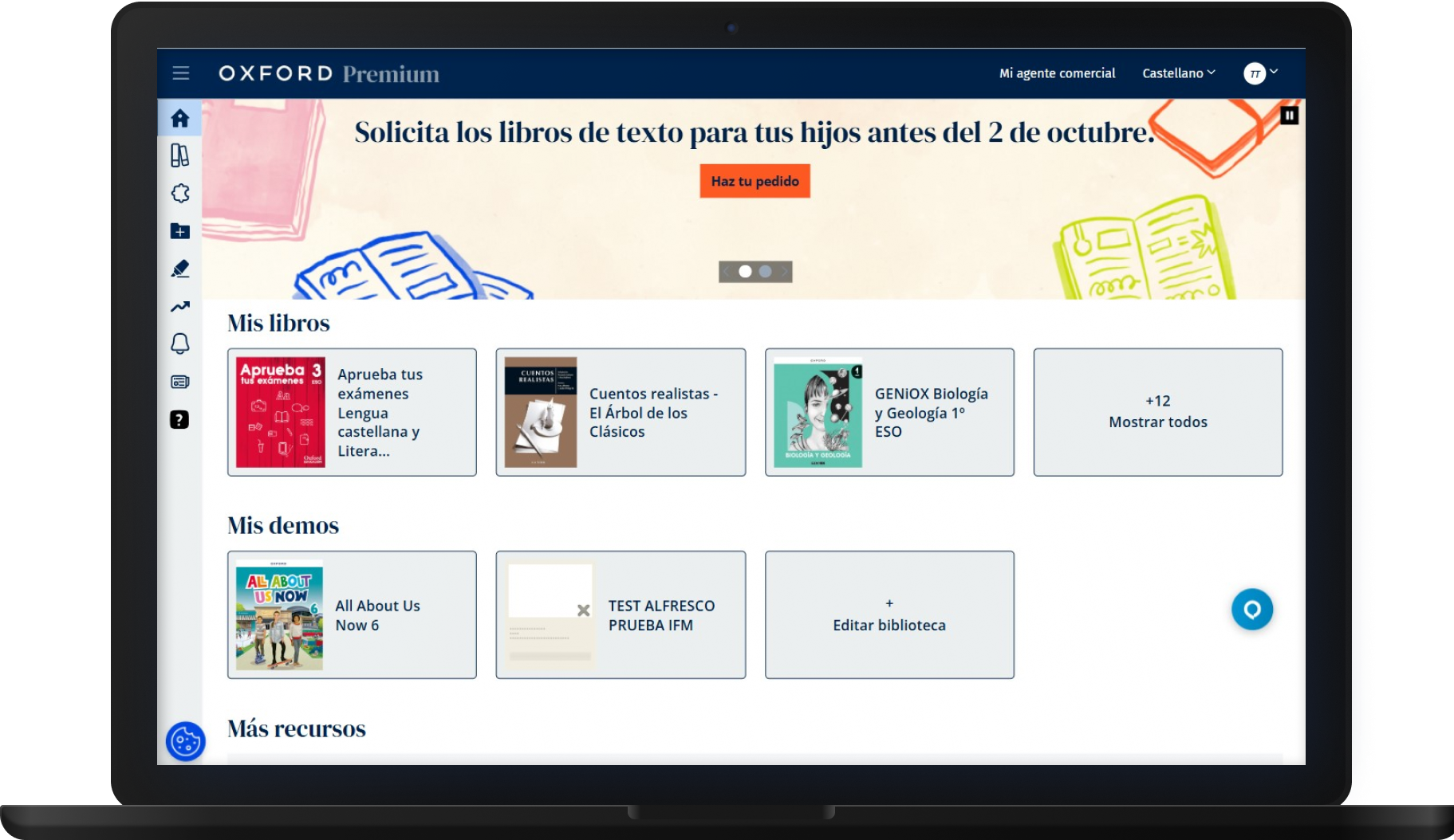
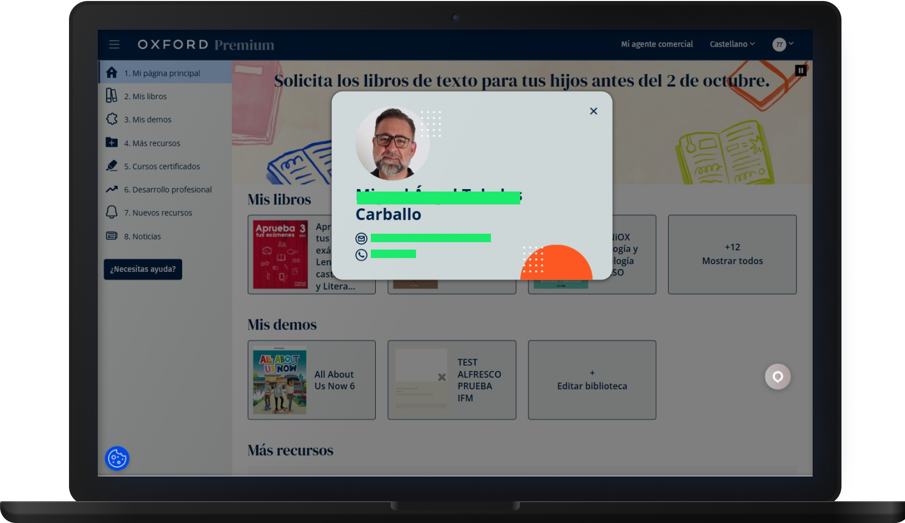
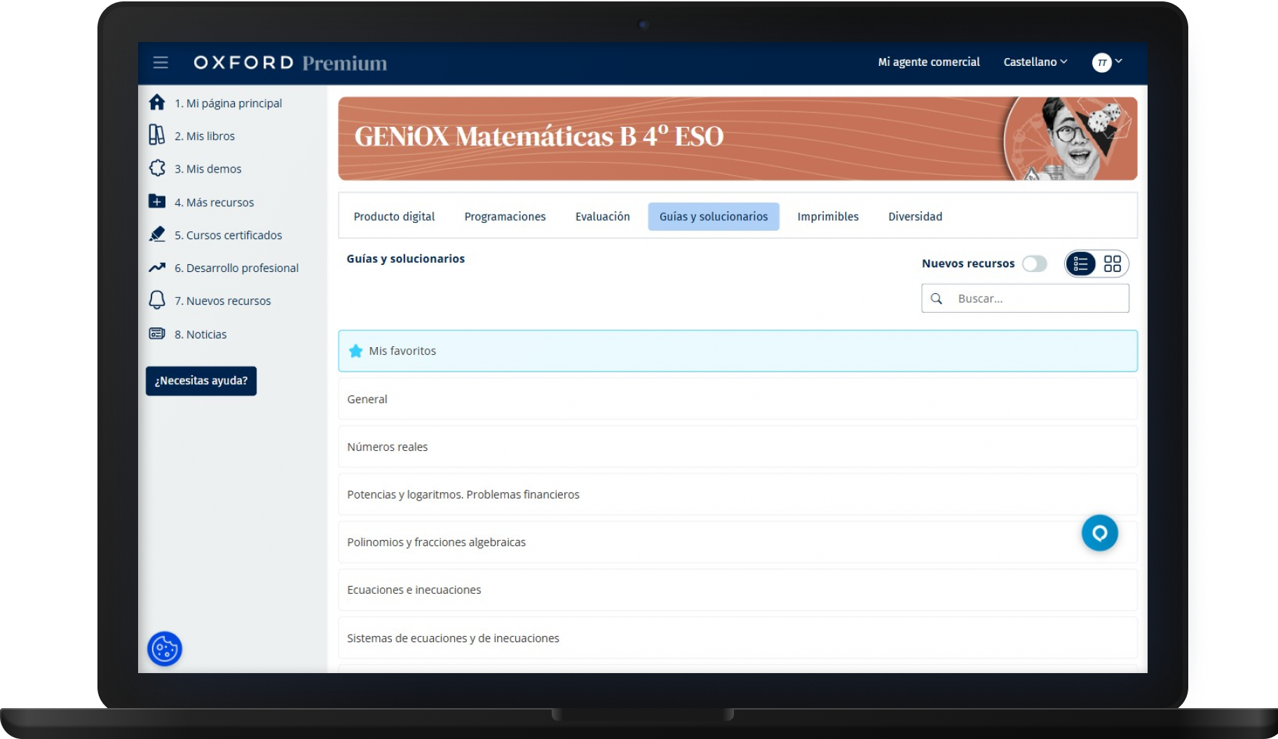

Oxford Premium had grown for years without a shared design language. I led the creation of a design system as part of a wider rebranding and platform redesign.
The goal was to simplify a complex educational ecosystem, improve consistency and support accessibility requirements.
Delivered: design system foundations, redesigned interaction flows and implementation documentation.
I worked as the sole UX/UI Designer on this project, which lasted 11 months in total: 7 months of design and strategy and 4 months of implementation and support. The scope covered a platform-wide redesign, information architecture and the foundations of a design system, and I worked with Figma, FigJam, Hotjar, Maze and Jira.
The project covered the redesign of Oxford Premium's experience, a new visual direction and the foundations of a scalable design system. This went beyond a UI kit or a small component library: a full redesign initiative connected to product strategy, platform structure, visual alignment and implementation.
Oxford Premium is a complex educational platform that brings together digital books, teaching resources, assessments, professional development content and other learning tools.
Over time, the platform had grown significantly. Different areas had evolved at different moments, which created inconsistencies in navigation, resource organisation, visual language and interaction patterns.
At the same time, the platform was going through a rebranding process and there was a long-term objective of bringing the experience closer to HUB, Oxford's UK platform. This created an opportunity to rethink the platform from a systems perspective, not only by redesigning screens, but by building a more coherent foundation for the whole experience.
I was the only designer working on the initiative and had full ownership from strategy to implementation support. My work spanned research and analysis, information architecture, UX strategy, interaction design, visual direction, design system foundations, documentation and implementation support, working directly with product, development, editorial, leadership and UK teams.
A significant part of the work involved presenting proposals, discussing trade-offs and validating visual and structural decisions as the project evolved. With no one else to escalate a design decision to, most of that validation happened in the room, in real time, with whoever the decision actually affected.
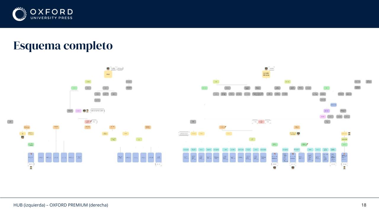
Before designing anything, I needed to understand how the platform actually worked. I mapped products, services, resource structures, navigation patterns, existing journeys and platform dependencies. The maps quickly became quite large.
More importantly, they revealed that the platform had gradually been organised around internal structures and historical decisions rather than around how teachers actually used it. The real problem was complexity, discoverability and consistency, not a lack of content.
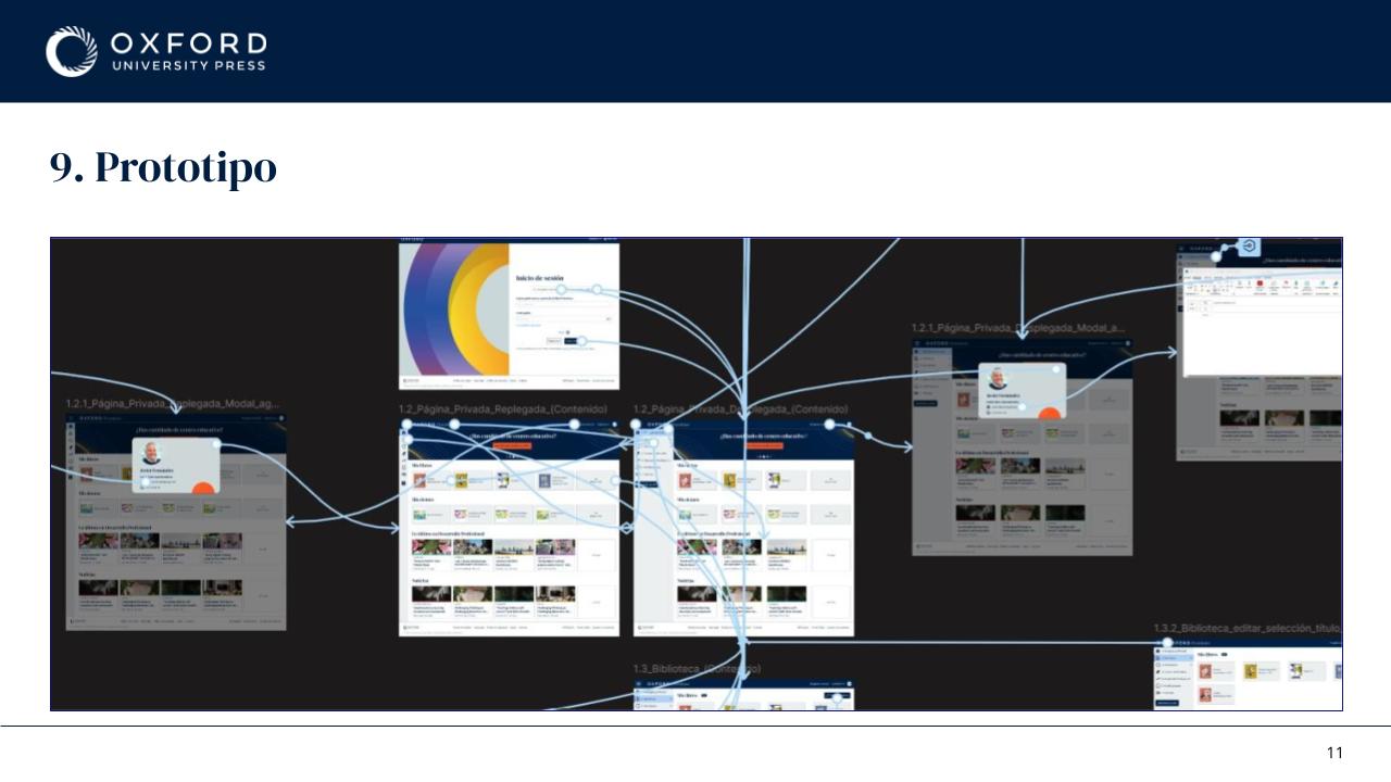
This project didn't move in a straight line. Comparative analysis with HUB, information architecture mapping, user flows, interaction redesign, wireframing, high-fidelity design, prototyping, documentation, design system foundations, stakeholder validation and progressive implementation with development all ran in parallel and continuously informed each other.
The project constantly moved between understanding the current experience, proposing solutions and refining decisions as new information appeared. It also connected directly with the wider redesign of Oxford Premium: navigation, resource browsing, search behaviour, filters, responsive layouts and reusable components all had to evolve together.
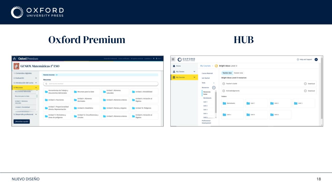
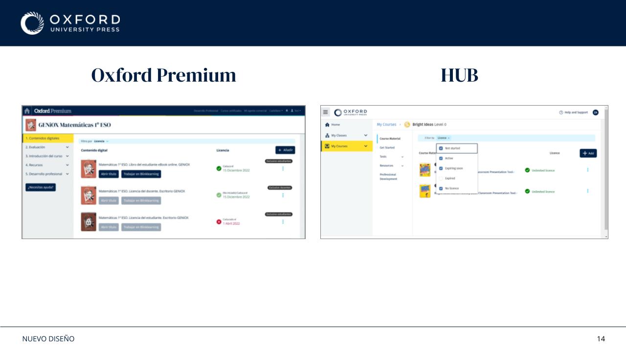
One of the strategic objectives was to bring Oxford Premium closer to HUB while respecting the needs and complexity of the local product. Some HUB patterns worked well as a reference, but Oxford Premium had more services, more resource types and different content needs, so most decisions needed adapting rather than direct reuse. The process gallery includes the platform comparison.
The work involved understanding HUB's visual and interaction principles, identifying opportunities for alignment, exploring new visual directions, adapting interaction patterns where appropriate and balancing consistency with local product needs. Throughout the project, I regularly presented and validated proposals with leadership and the UK team.
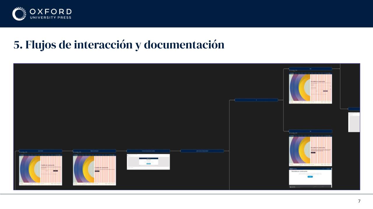
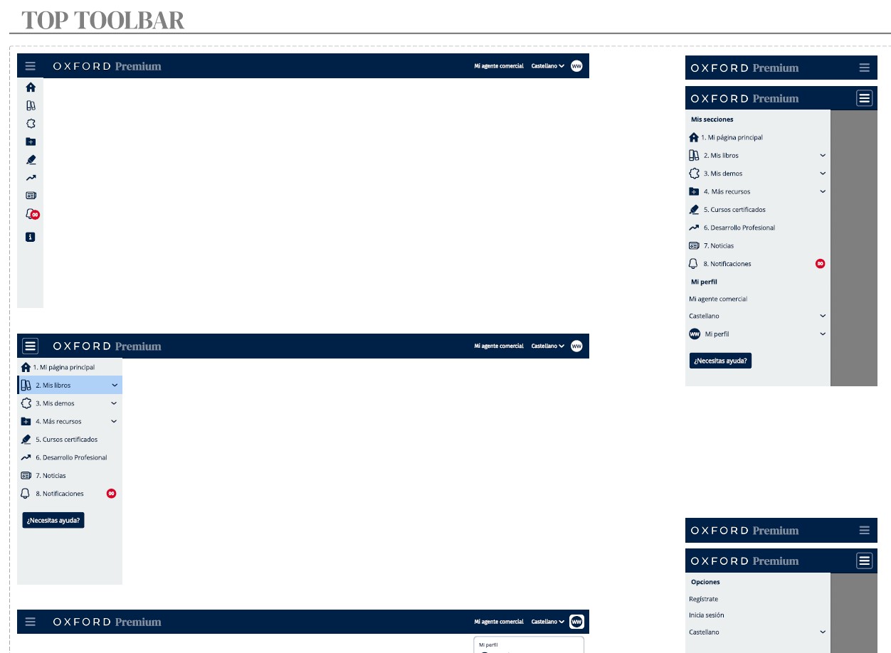
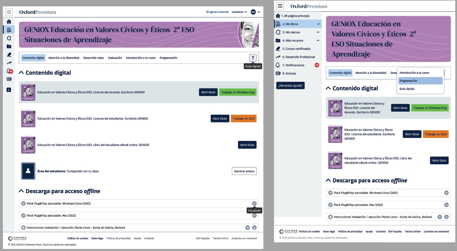
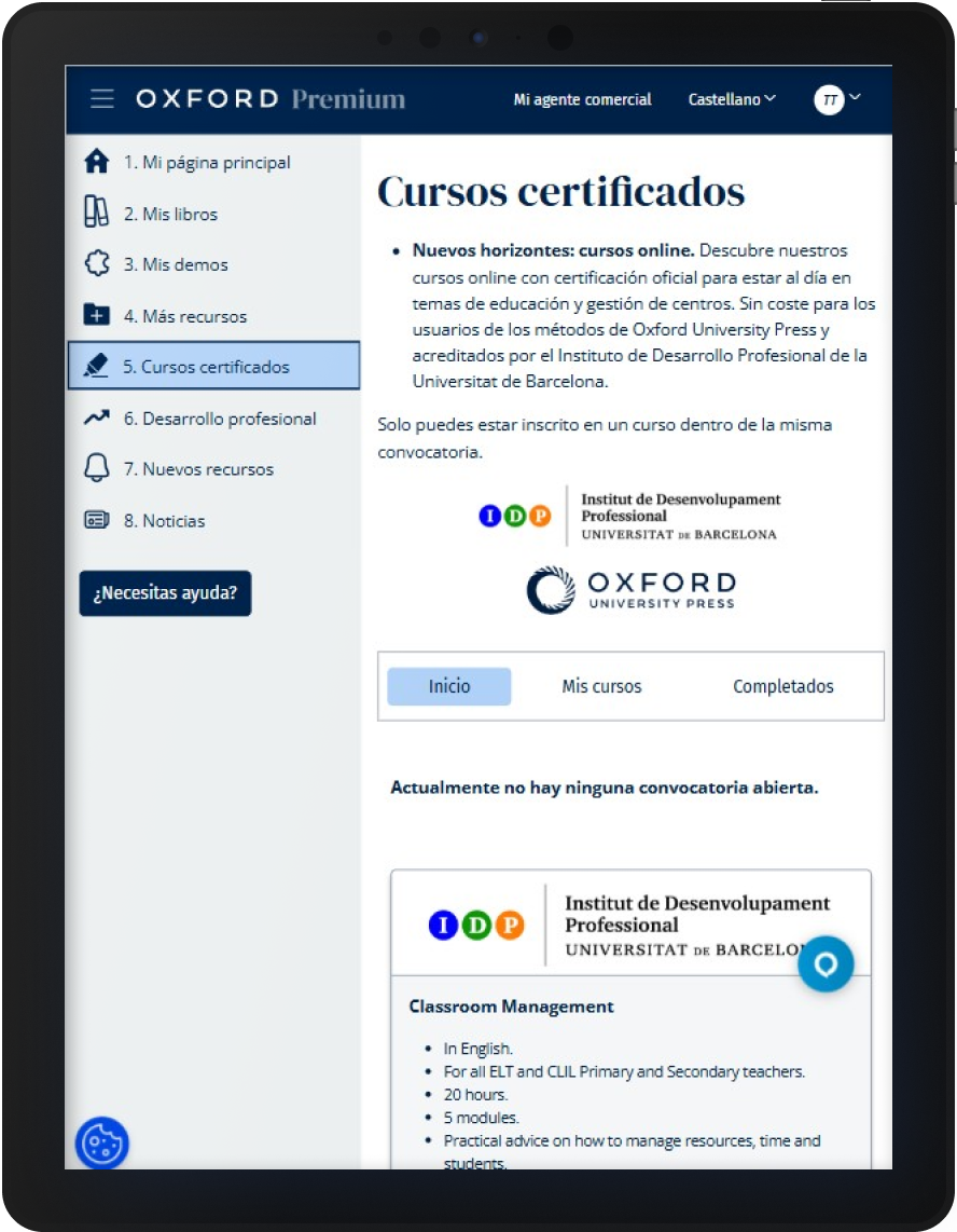
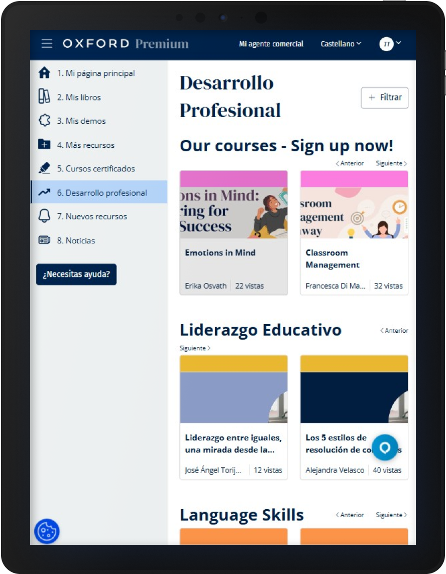
The work went far beyond reorganising information. I redesigned the interaction model itself: entry points, navigation flows, resource browsing, search behaviours, filtering patterns and resource hierarchy. The focus was on reducing unnecessary decisions and making navigation more predictable.
Rather than asking teachers to understand how the platform was organised internally, the experience was reorganised around what they were trying to achieve.
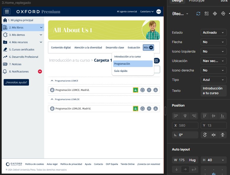
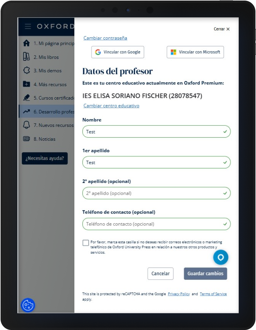
As the redesign progressed, it became clear that consistency could not be solved screen by screen. I created the foundations for a design system covering typography, colour system, components, spacing rules, responsive behaviours, accessibility requirements and documentation.
The goal was a shared foundation that could support future work and reduce implementation complexity. A shared language for future product work, instead of treating each screen as an isolated solution.
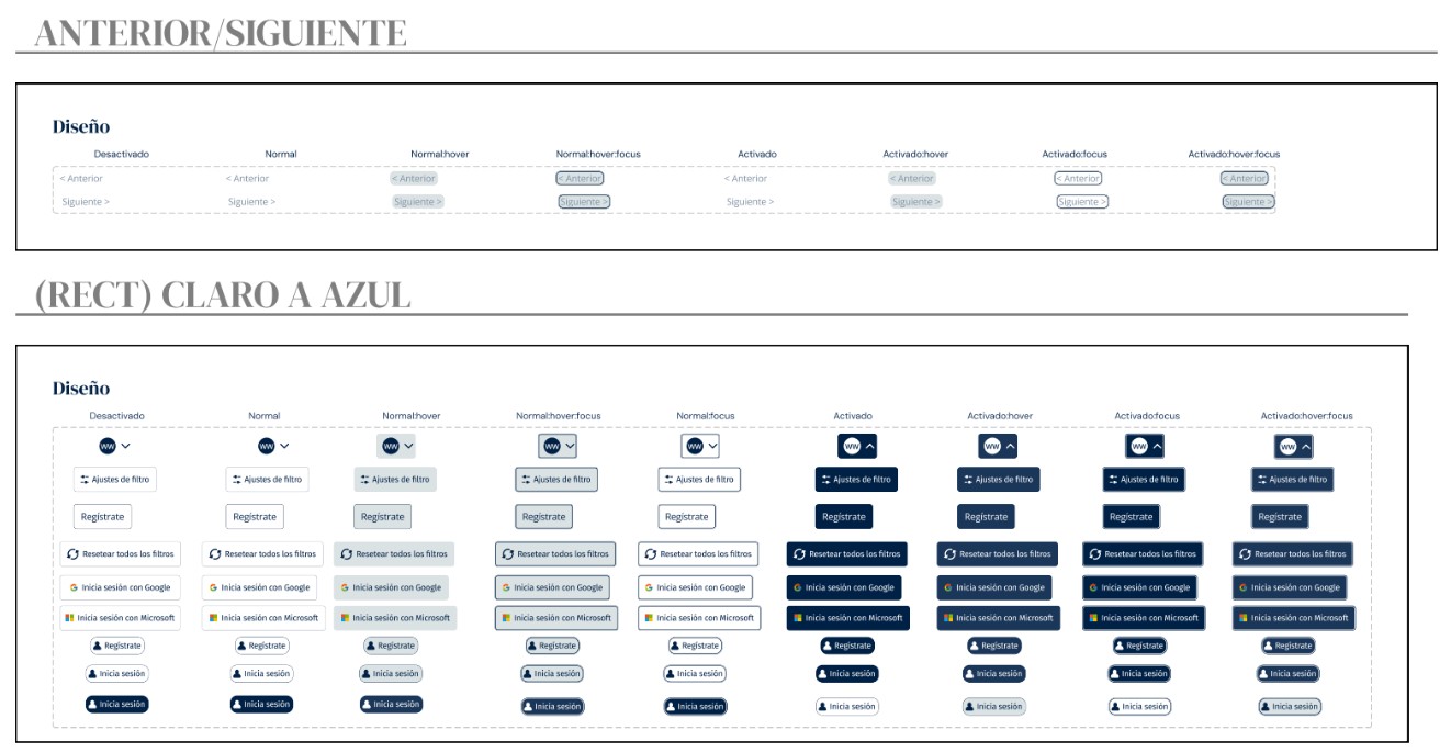
The implementation phase lasted four months and happened progressively. I worked closely with developers to clarify behaviours, produce documentation, review implementations, support handoff and iterate on solutions.
Because the project touched almost every area of the platform, keeping design and development aligned became just as important as the design work itself.
The project delivered a new information architecture, simplified navigation patterns, redesigned interaction flows, improved discoverability, closer alignment with the UK's platform (HUB), the foundations for a scalable design system and a complete redesign of the platform experience.
Beyond the redesign itself, the design system became a single source of truth for designers and developers, improving consistency, reducing ambiguity during implementation and streamlining collaboration across teams. It also enabled faster design iterations and more realistic prototypes, allowing ideas to be validated with users through Maze before development, reducing risk and supporting more informed product decisions.
More importantly, the project helped reduce complexity in a platform that had grown faster than its structure, creating a more coherent foundation that could evolve consistently over time.
One thing this project reinforced for me is that the biggest UX problems are rarely caused by missing features. More often, they appear when products grow faster than their structure.
More than redesigning screens, this project was about reducing complexity and helping people spend less time understanding the platform and more time using it.
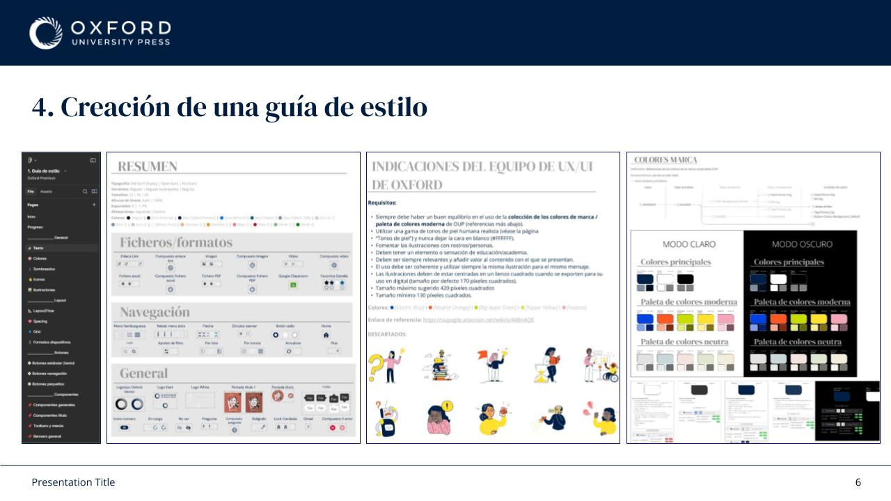
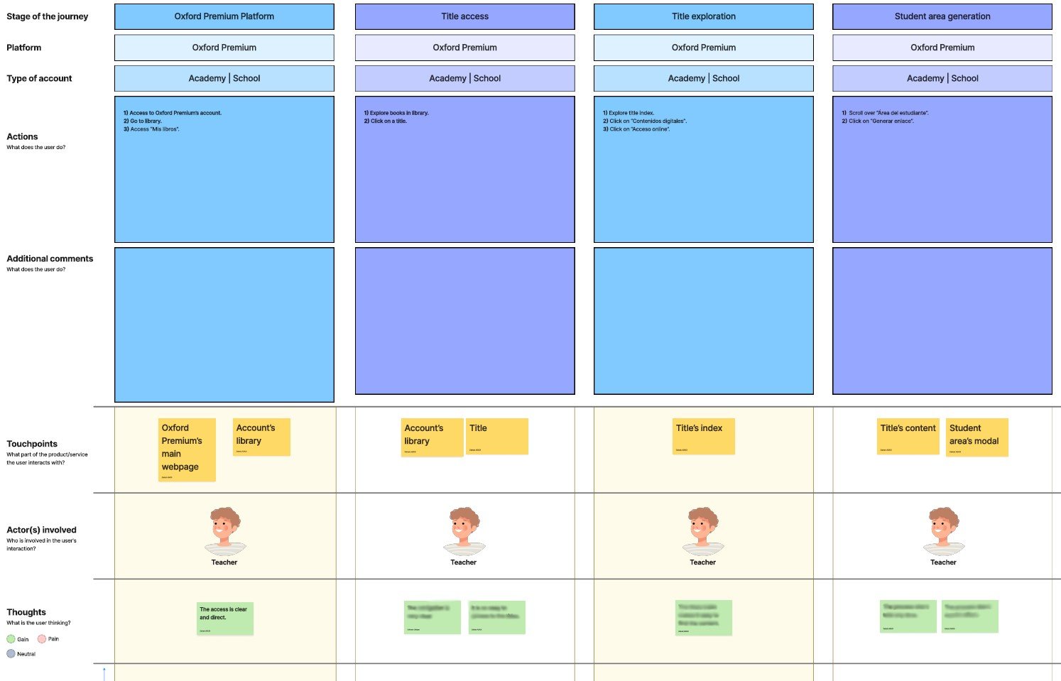
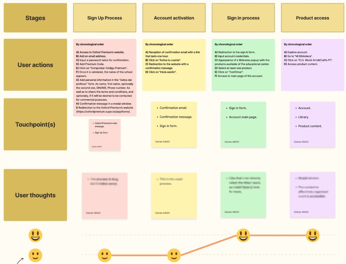

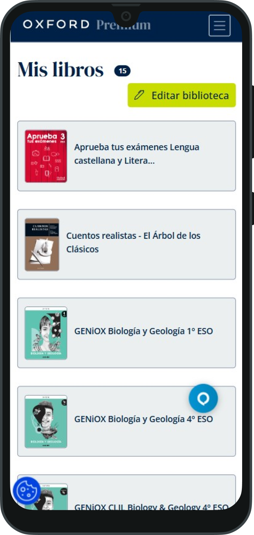
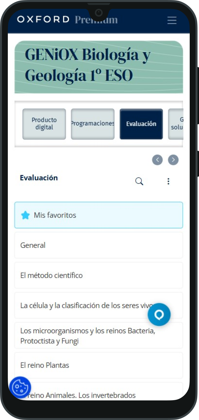
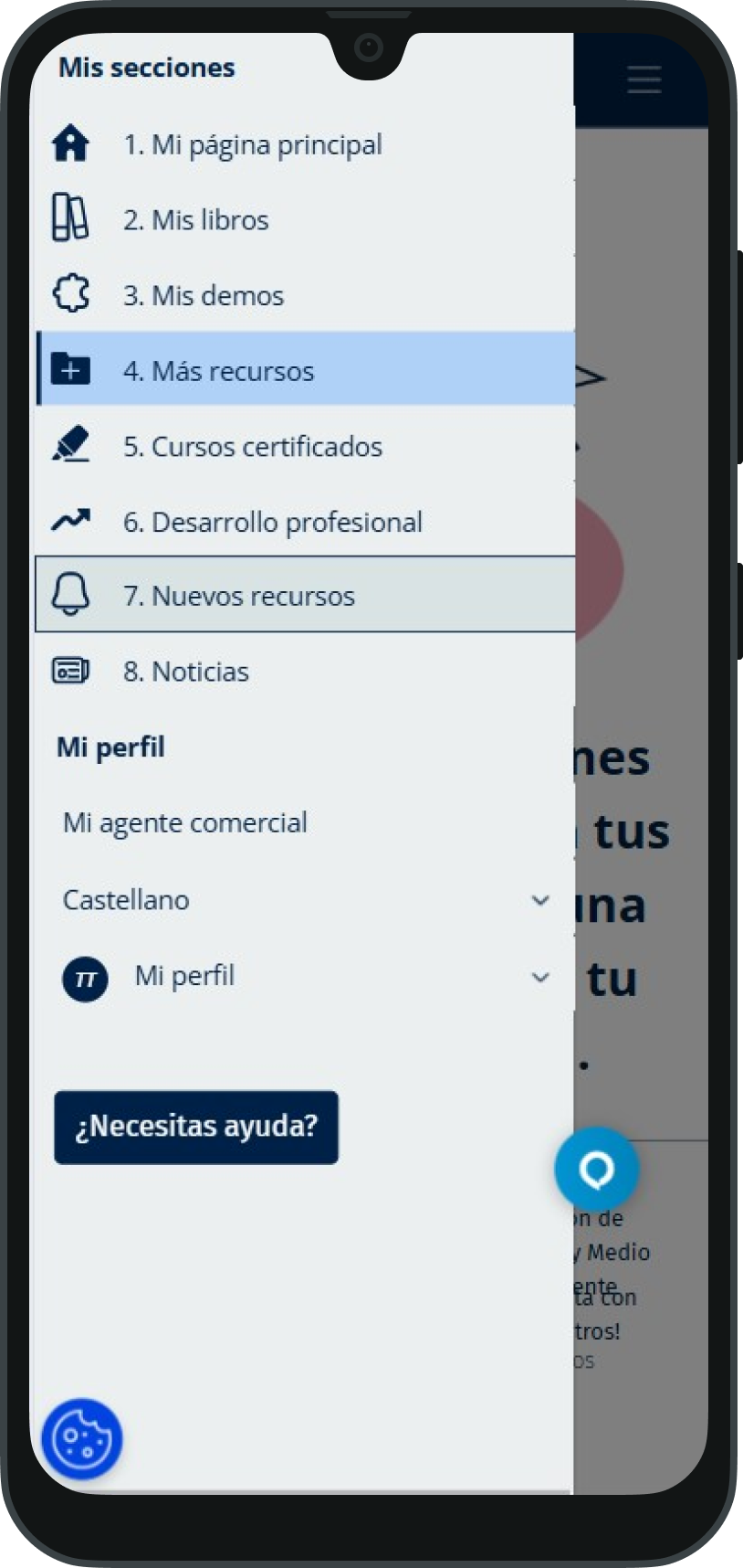
This project is subject to confidentiality agreements, so some internal deliverables, research artefacts, documentation, and design files cannot be publicly shared. The examples included here have been adapted to illustrate my process, decisions, and contributions while respecting those commitments.
If you'd like to learn more about the project, my role, or the outcomes achieved, I'd be happy to discuss them during an interview.